Cultural Tech-Fusion Fabrics


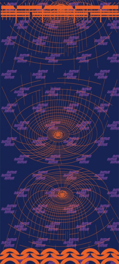
This design below draws upon fusionwear sv images submitted of Eichler architecture by Kathleen Peters, San Jose City Hall and Spanish tile roofs...all part of our visual vocabulary here in Silicon Valley. The design is also meant to riff off of sari textile design and colors. Anu Guda submitted many amazing saris for me to document and in the process got me thinking about weaving techniques and color schemes.  Colors were pulled from a color palette from  fusionwear sv image submissions and from Anu's textiles.
Picture
Picture
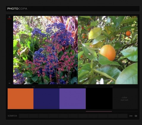
I pulled the color palette from these image submissions by Kathleen Peters.
Picture
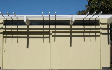
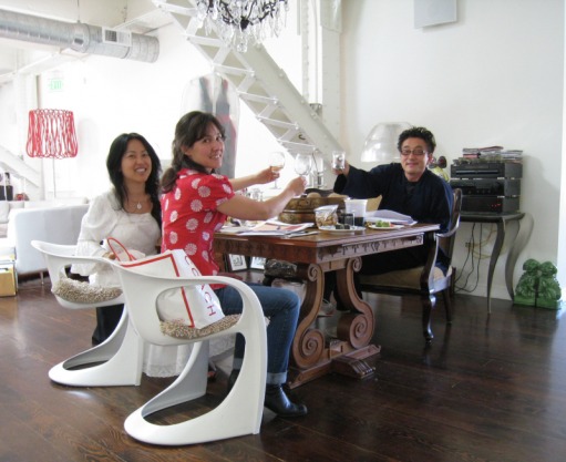
photo by Kathleen Peters
Picture
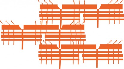
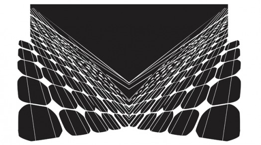
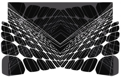
Shadows from above image rendered in Illustrator and then arranged to mimic an ikat design
Picture
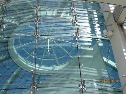
Photo By Cole Takara of San Jose City Hall Rotunda.
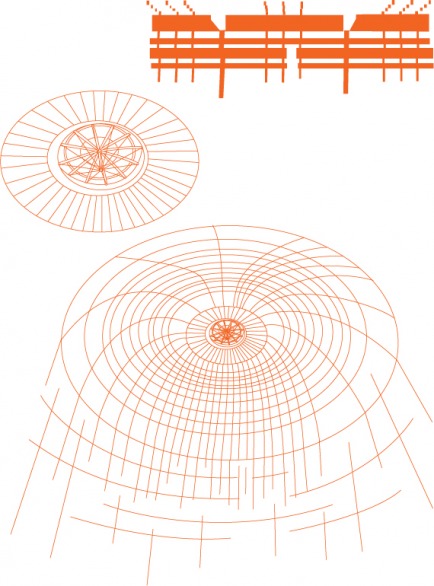
Picture
Illustrator studies
Picture
Spanish tile design created in Illustrator above inspired by local Spanish tile roofs such as at Hayes Mansion. Example here is a Quinceanera photo by Hector Villablanca.
Picture
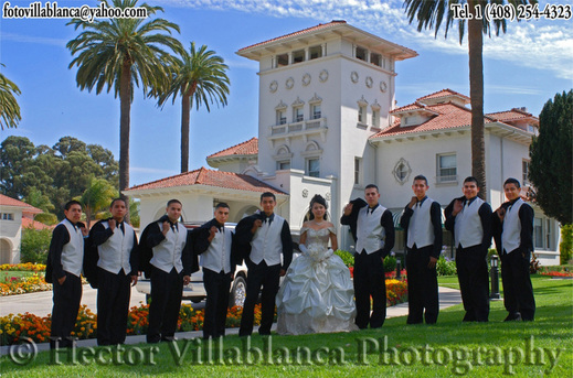
Photo by Hector Villablanca. www.FotoVillablanca.com
 
Here is the third textile fabric I am working on for the fusionwear sv project. This textile reflects on information graphics, speed of and nodes of connections in Silicon Valley. I ran several websites (Silicon Valley Community Newspapers, fusionwear sv and the San Jose International Airport) through a freeware applet, Aharef, which renders websites graphically. I ran one lay of the imagery through a motion blur to allude to the rapid pace of life here. I wanted to use this type of information graphic representation as the resulting forms remind me of spores blown on the wind.
Picture
Detail of textile design
Picture
Picture
Image of full width of fabric
 
Picture
Picture
Drawing inspiration from an image submission of solar panels by Kathleen Peters, I created this textile design. Silicon Valley is a leader in solar technology and Kathleen's image submissions to the fusionwear sv image pool highlighted this important local industry.

In creating this textile, I learned that it was best to create the shapes in organic forms. At first I had use straight lines and grids, but it felt sterile. When I re rendered the design freehand (using a Wacom stylus) it felt right. I felt the shapes were more organic and echoed traditional textile work such as batik in the way the lines break and swell in places; it reminds  me of Japantown restaurant norin curtains which often use this dying technique.

I created this in Illustrator and then took it into Photoshop. This image will remain black and white for the fabric printing. Colleen Quen, Rick Lee and I discussed color palettes today and we agreed that we wanted at least one Black and White design.

A few days ago we were notified that we have additional grant funding to bring in designer Rick Lee to create the environment for the installation. I am so very excited to be working with these two very talented and professional artists. I know that I will be learning a lot from both in the process of bringing this project to life.

Rick Lee's website is http://www.rickleedesign.com/

and Colleen Quen's website is: http://www.colleenquencouture.com/
Picture
Colleen, Rick and I celebrating our collaboration today. This is the morning after their Bamboo and Silk exhibition. I wish that Jane Przybysz, Director of The San Jose Museum of Quilts & Textiles, could have been there to celebrate with us. She wrote the grants!